Examples


Documentation
Overview
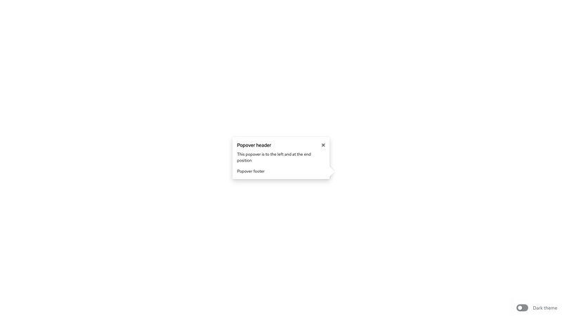
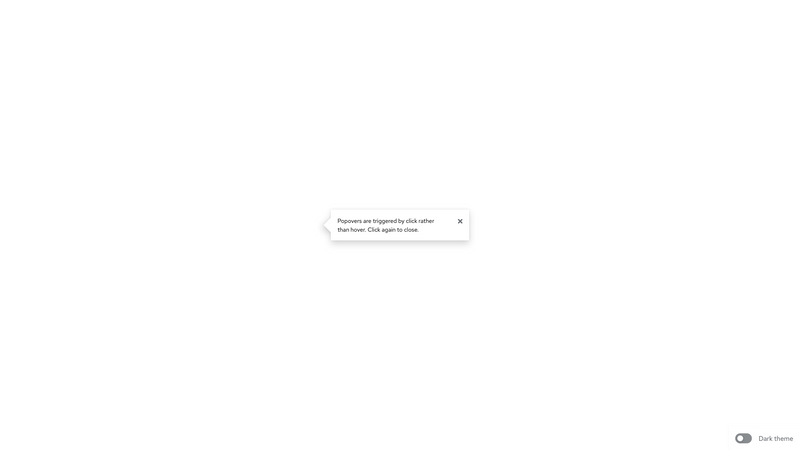
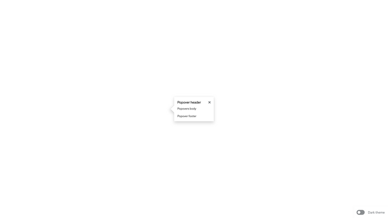
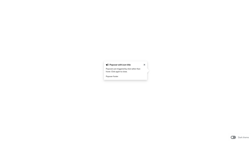
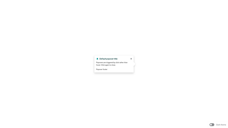
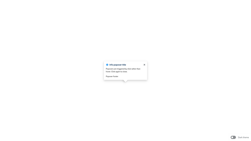
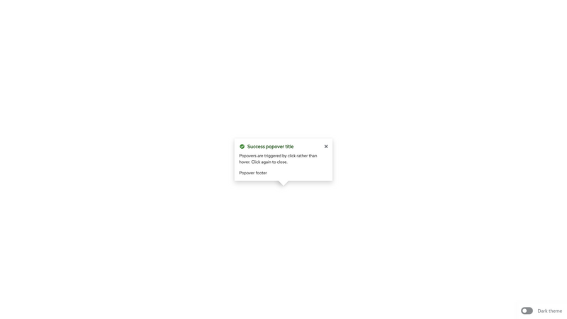
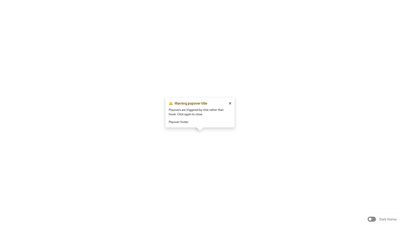
A popover is used to provide contextual information for another component on click. The popover itself is made up of two main elements: arrow and content. The content element follows the pattern of the popover box component, with a close icon in the top right corner, as well as a header and body. One of the directional modifiers (.pf-m-left, .pf-m-top, etc.) is required on the popover component
Accessibility
Attribute | Applies to | Outcome |
|---|---|---|
role="dialog" | .pf-c-popover | Identifies the element that serves as the popover container. Required |
aria-labelledby="[id value of .pf-c-title]" | .pf-c-popover | Gives the popover an accessible name by referring to the element that provides the dialog title. Required when .pf-c-title is present |
aria-label="[title of popover]" | .pf-c-popover | Gives the popover an accessible name. Required when .pf-c-title is not present |
aria-describedby="[id value of applicable content]" | .pf-c-popover | Gives the popover an accessible description by referring to the popover content that describes the primary message or purpose of the dialog. Not used if there is no static text that describes the popover. |
aria-modal="true" | .pf-c-popover | Tells assistive technologies that the windows underneath the current popover are not available for interaction. Required |
aria-label="Close" | .pf-c-button | Provides an accessible name for the close button as it uses an icon instead of text. Required |
aria-hidden="true" | Parent element containing the page contents when the popover is open. | Hides main contents of the page from screen readers. The element with .pf-c-popover must not be a descendent of the element with aria-hidden="true". For more info, see trapping focus. Required |
Usage
Class | Applied to | Outcome |
|---|---|---|
.pf-c-popover | <div> | Creates a popover. Always use it with a modifier class that positions the popover relative to the element that triggered it. Required |
.pf-c-popover__arrow | <div> | Creates an arrow pointing towards the element the popover describes. Required |
.pf-c-popover__content | <div> | Creates the content area of the popover. Required |
.pf-c-button | <button> | Positions the close icon in the top-right corner of the popover. Required |
.pf-c-popover__header | <header> | Creates the popover header |
.pf-c-popover__title | <h1>,<h2>,<h3>,<h4>,<h5>,<h6>,<div> | Creates the popover title |
.pf-c-title | <h1>,<h2>,<h3>,<h4>,<h5>,<h6> | Initiates a title. Always use it with a modifier class. See the title component for more info. |
.pf-c-popover__title-icon | <span> | Creates the popover title icon |
.pf-c-popover__title-text | <span> | Creates the popover title text |
.pf-c-popover__body | <div> | The popover's body text. Required |
.pf-c-popover__footer | <footer> | Initiates a popover footer. |
.pf-m-left{-top/bottom} | .pf-c-popover | Positions the popover to the left (or left top/left bottom) of the element. |
.pf-m-right{-top/bottom} | .pf-c-popover | Positions the popover to the right (or right top/right bottom) of the element. |
.pf-m-top{-left/right} | .pf-c-popover | Positions the popover to the top (or top left/top right) of the element. |
.pf-m-bottom{-left/right} | .pf-c-popover | Positions the popover to the bottom (or bottom left/bottom right) of the element. |
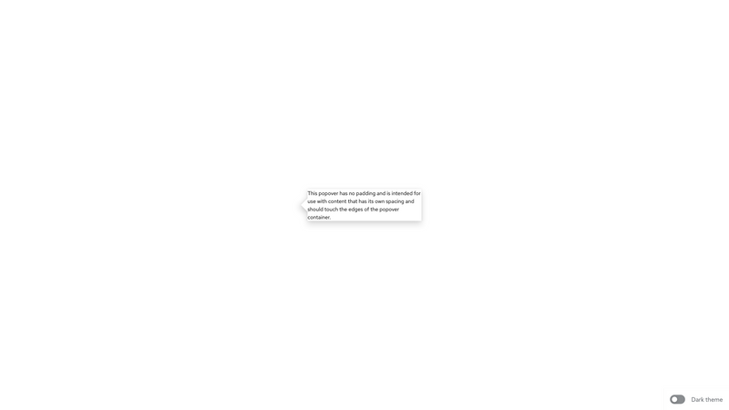
.pf-m-no-padding | .pf-c-popover | Removes the outer padding from the popover content. |
.pf-m-width-auto | .pf-c-popover | Allows popover width to be defined by the popover content. |
.pf-m-icon | .pf-c-popover__title | Modifies the title layout to accommodate an icon. |
.pf-m-default | .pf-c-popover | Modifies for the default alert state. |
.pf-m-info | .pf-c-popover | Modifies for the info alert state. |
.pf-m-success | .pf-c-popover | Modifies for the success alert state. |
.pf-m-warning | .pf-c-popover | Modifies for the warning alert state. |
.pf-m-danger | .pf-c-popover | Modifies for the danger alert state. |
CSS variables
| .pf-c-popover | --pf-c-popover--FontSize | 0.875rem | ||
| .pf-c-popover | --pf-c-popover--MinWidth | calc(1rem + 1rem + 18.75rem) | ||
| .pf-c-popover | --pf-c-popover--MaxWidth | calc(1rem + 1rem + 18.75rem) | ||
| .pf-c-popover | --pf-c-popover--BoxShadow | 0 0.5rem 1rem 0 rgba(3, 3, 3, 0.16), 0 0 0.375rem 0 rgba(3, 3, 3, 0.08) | ||
| .pf-c-popover | --pf-c-popover--m-danger__title-icon--Color | #c9190b | ||
| .pf-c-popover | --pf-c-popover--m-warning__title-icon--Color | #f0ab00 | ||
| .pf-c-popover | --pf-c-popover--m-success__title-icon--Color | #3e8635 | ||
| .pf-c-popover | --pf-c-popover--m-info__title-icon--Color | #2b9af3 | ||
| .pf-c-popover | --pf-c-popover--m-default__title-icon--Color | #009596 | ||
| .pf-c-popover | --pf-c-popover--m-danger__title-text--Color | #a30000 | ||
| .pf-c-popover | --pf-c-popover--m-warning__title-text--Color | #795600 | ||
| .pf-c-popover | --pf-c-popover--m-success__title-text--Color | #1e4f18 | ||
| .pf-c-popover | --pf-c-popover--m-info__title-text--Color | #002952 | ||
| .pf-c-popover | --pf-c-popover--m-default__title-text--Color | #003737 | ||
| .pf-c-popover | --pf-c-popover__content--BackgroundColor | #fff | ||
| .pf-c-popover | --pf-c-popover__content--PaddingTop | 1rem | ||
| .pf-c-popover | --pf-c-popover__content--PaddingRight | 1rem | ||
| .pf-c-popover | --pf-c-popover__content--PaddingBottom | 1rem | ||
| .pf-c-popover | --pf-c-popover__content--PaddingLeft | 1rem | ||
| .pf-c-popover | --pf-c-popover__arrow--Width | 1.5625rem | ||
| .pf-c-popover | --pf-c-popover__arrow--Height | 1.5625rem | ||
| .pf-c-popover | --pf-c-popover__arrow--BoxShadow | 0 0.5rem 1rem 0 rgba(3, 3, 3, 0.16), 0 0 0.375rem 0 rgba(3, 3, 3, 0.08) | ||
| .pf-c-popover | --pf-c-popover__arrow--BackgroundColor | #fff | ||
| .pf-c-popover | --pf-c-popover__arrow--m-top--TranslateX | -50% | ||
| .pf-c-popover | --pf-c-popover__arrow--m-top--TranslateY | 50% | ||
| .pf-c-popover | --pf-c-popover__arrow--m-top--Rotate | 45deg | ||
| .pf-c-popover | --pf-c-popover__arrow--m-right--TranslateX | -50% | ||
| .pf-c-popover | --pf-c-popover__arrow--m-right--TranslateY | -50% | ||
| .pf-c-popover | --pf-c-popover__arrow--m-right--Rotate | 45deg | ||
| .pf-c-popover | --pf-c-popover__arrow--m-bottom--TranslateX | -50% | ||
| .pf-c-popover | --pf-c-popover__arrow--m-bottom--TranslateY | -50% | ||
| .pf-c-popover | --pf-c-popover__arrow--m-bottom--Rotate | 45deg | ||
| .pf-c-popover | --pf-c-popover__arrow--m-left--TranslateX | 50% | ||
| .pf-c-popover | --pf-c-popover__arrow--m-left--TranslateY | -50% | ||
| .pf-c-popover | --pf-c-popover__arrow--m-left--Rotate | 45deg | ||
| .pf-c-popover | --pf-c-popover--c-button--MarginLeft | 0.5rem | ||
| .pf-c-popover | --pf-c-popover--c-button--Top | calc(1rem - 0.375rem) | ||
| .pf-c-popover | --pf-c-popover--c-button--Right | calc(1rem - 1rem) | ||
| .pf-c-popover | --pf-c-popover--c-button--sibling--PaddingRight | 3rem | ||
| .pf-c-popover | --pf-c-popover--c-title--MarginBottom | 0.5rem | ||
| .pf-c-popover | --pf-c-popover__title--MarginBottom | 0.5rem | ||
| .pf-c-popover | --pf-c-popover__title--LineHeight | 1.5 | ||
| .pf-c-popover | --pf-c-popover__title--FontFamily | '"RedHatDisplay", "Overpass", overpass, helvetica, arial, sans-serif' | ||
| .pf-c-popover | --pf-c-popover__title--FontSize | 1rem | ||
| .pf-c-popover | --pf-c-popover__title-icon--MarginRight | 0.5rem | ||
| .pf-c-popover | --pf-c-popover__title-icon--Color | #151515 | ||
| .pf-c-popover | --pf-c-popover__footer--MarginTop | 1rem | ||
| .pf-c-popover.pf-m-no-padding | --pf-c-popover__content--PaddingTop | 0px | ||
| .pf-c-popover.pf-m-no-padding | --pf-c-popover__content--PaddingRight | 0px | ||
| .pf-c-popover.pf-m-no-padding | --pf-c-popover__content--PaddingBottom | 0px | ||
| .pf-c-popover.pf-m-no-padding | --pf-c-popover__content--PaddingLeft | 0px | ||
| .pf-c-popover.pf-m-width-auto | --pf-c-popover--MinWidth | auto | ||
| .pf-c-popover.pf-m-width-auto | --pf-c-popover--MaxWidth | none | ||
| .pf-c-popover.pf-m-danger | --pf-c-popover__title-icon--Color | #c9190b | ||
| .pf-c-popover.pf-m-danger | --pf-c-popover__title-text--Color | #a30000 | ||
| .pf-c-popover.pf-m-warning | --pf-c-popover__title-icon--Color | #f0ab00 | ||
| .pf-c-popover.pf-m-warning | --pf-c-popover__title-text--Color | #795600 | ||
| .pf-c-popover.pf-m-success | --pf-c-popover__title-icon--Color | #3e8635 | ||
| .pf-c-popover.pf-m-success | --pf-c-popover__title-text--Color | #1e4f18 | ||
| .pf-c-popover.pf-m-default | --pf-c-popover__title-icon--Color | #009596 | ||
| .pf-c-popover.pf-m-default | --pf-c-popover__title-text--Color | #003737 | ||
| .pf-c-popover.pf-m-info | --pf-c-popover__title-icon--Color | #2b9af3 | ||
| .pf-c-popover.pf-m-info | --pf-c-popover__title-text--Color | #002952 | ||
View source on GitHub