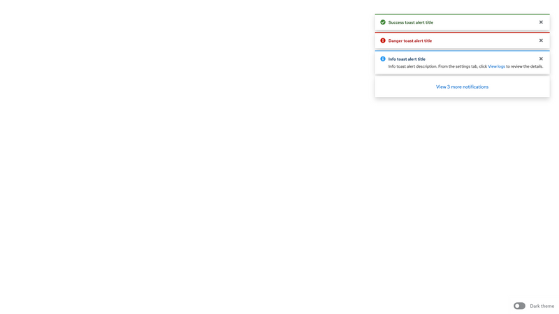
Success alert:
Success alert title
Danger alert:
Danger alert title
Info alert:
Info alert title
.pf-c-alert-group is optional when only one alert is needed. It becomes required when more than one alert is used in a list.
Attribute
Applied to
Outcome
.pf-c-alert-group
<ul>
Creates an alert group component. Required
.pf-c-alert-group__item
<li>
Creates an alert group item. Required
An alert group that includes the .pf-m-toast modifier becomes a toast alert group with unique positioning in the top-right corner of the window. .pf-c-alert-group is required to create a toast alert group.
Every toast alert must include a close button to dismiss the alert.
When toast alerts include a link or action, these elements are not announced as interactive elements by screen readers. Whenever you include a link or button, incorporate it into the message so that it’s clear to the user how to access the same contents or action without clicking the link or button directly in the toast. For example, if your toast alert displays a message “The build is complete. Go to the Builds page to download,” the screen reader user is given instructions on how to find their build for download.
For sighted users, interactive elements can be included in this message in one of the following ways:
Using a link to the Builds page: “The build is complete. Go to the Builds page to download” using <a href="url">Builds</a> Using a button to download: “The build is complete. Go to the Builds page to download " using <button class="pf-c-button pf-m-link pf-m-inline type="button">download</button> Class
Applied to
Outcome
.pf-m-toast
.pf-c-alert-group
Applies toast alert styling to an alert group.
.pf-c-alert-group__overflow-button
<button>
Applies overflow button styling to an alert group overflow button.
Alert groups are used to contain and align consecutive alerts. Groups can either be embedded alongside a page's content or in the top-right corner as a toast group using the .pf-m-toast modifier.
.pf-c-alert-group --pf-c-alert-group__item--MarginTop --pf-c-alert-group__item--MarginTop
.pf-c-alert-group --pf-c-alert-group--m-toast--Top --pf-c-alert-group--m-toast--Top
.pf-c-alert-group --pf-c-alert-group--m-toast--Right --pf-c-alert-group--m-toast--Right
.pf-c-alert-group --pf-c-alert-group--m-toast--MaxWidth .pf-c-alert-group --pf-c-alert-group--m-toast--ZIndex --pf-c-alert-group--m-toast--ZIndex
.pf-c-alert-group --pf-c-alert-group__overflow-button--BorderWidth .pf-c-alert-group --pf-c-alert-group__overflow-button--PaddingTop --pf-c-alert-group__overflow-button--PaddingTop
.pf-c-alert-group --pf-c-alert-group__overflow-button--PaddingRight --pf-c-alert-group__overflow-button--PaddingRight
.pf-c-alert-group --pf-c-alert-group__overflow-button--PaddingBottom --pf-c-alert-group__overflow-button--PaddingBottom
.pf-c-alert-group --pf-c-alert-group__overflow-button--PaddingLeft --pf-c-alert-group__overflow-button--PaddingLeft
.pf-c-alert-group --pf-c-alert-group__overflow-button--Color --pf-c-alert-group__overflow-button--Color
$pf-global--primary-color--100 .pf-c-alert-group --pf-c-alert-group__overflow-button--BoxShadow 0 0.5rem 1rem 0 rgba(3, 3, 3, 0.16), 0 0 0.375rem 0 rgba(3, 3, 3, 0.08)
--pf-c-alert-group__overflow-button--BoxShadow
--pf-global--BoxShadow--lg $pf-global--BoxShadow--lg 0 pf-size-prem(8px) pf-size-prem(16px) 0 rgba($pf-color-black-1000, .16), 0 0 pf-size-prem(6px) 0 rgba($pf-color-black-1000, .08) 0 pf-size-prem(8px) pf-size-prem(16px) 0 rgba(#030303, .16), 0 0 pf-size-prem(6px) 0 rgba(#030303, .08) 0 0.5rem 1rem 0 rgba(3, 3, 3, 0.16), 0 0 0.375rem 0 rgba(3, 3, 3, 0.08) .pf-c-alert-group --pf-c-alert-group__overflow-button--BackgroundColor --pf-c-alert-group__overflow-button--BackgroundColor
--pf-global--BackgroundColor--100 $pf-global--BackgroundColor--100 .pf-c-alert-group --pf-c-alert-group__overflow-button--hover--Color --pf-c-alert-group__overflow-button--hover--Color
--pf-global--link--Color--hover $pf-global--link--Color--hover $pf-global--primary-color--200 .pf-c-alert-group --pf-c-alert-group__overflow-button--hover--BoxShadow 0 0.5rem 1rem 0 rgba(3, 3, 3, 0.16), 0 0 0.375rem 0 rgba(3, 3, 3, 0.08), 0 0.75rem 0.75rem -0.5rem rgba(3, 3, 3, 0.18)
--pf-c-alert-group__overflow-button--hover--BoxShadow
--pf-global--BoxShadow--lg, --pf-global--BoxShadow--lg-bottom $pf-global--BoxShadow--lg, $pf-global--BoxShadow--lg-bottom 0 pf-size-prem(8px) pf-size-prem(16px) 0 rgba($pf-color-black-1000, .16), 0 0 pf-size-prem(6px) 0 rgba($pf-color-black-1000, .08), 0 pf-size-prem(12px) pf-size-prem(12px) pf-size-prem(-8px) rgba($pf-color-black-1000, .18) 0 pf-size-prem(8px) pf-size-prem(16px) 0 rgba(#030303, .16), 0 0 pf-size-prem(6px) 0 rgba(#030303, .08), 0 pf-size-prem(12px) pf-size-prem(12px) pf-size-prem(-8px) rgba(#030303, .18) 0 0.5rem 1rem 0 rgba(3, 3, 3, 0.16), 0 0 0.375rem 0 rgba(3, 3, 3, 0.08), 0 0.75rem 0.75rem -0.5rem rgba(3, 3, 3, 0.18) .pf-c-alert-group --pf-c-alert-group__overflow-button--focus--Color --pf-c-alert-group__overflow-button--focus--Color
--pf-global--link--Color--hover $pf-global--link--Color--hover $pf-global--primary-color--200 .pf-c-alert-group --pf-c-alert-group__overflow-button--focus--BoxShadow 0 0.5rem 1rem 0 rgba(3, 3, 3, 0.16), 0 0 0.375rem 0 rgba(3, 3, 3, 0.08), 0 0.75rem 0.75rem -0.5rem rgba(3, 3, 3, 0.18)
--pf-c-alert-group__overflow-button--focus--BoxShadow
--pf-global--BoxShadow--lg, --pf-global--BoxShadow--lg-bottom $pf-global--BoxShadow--lg, $pf-global--BoxShadow--lg-bottom 0 pf-size-prem(8px) pf-size-prem(16px) 0 rgba($pf-color-black-1000, .16), 0 0 pf-size-prem(6px) 0 rgba($pf-color-black-1000, .08), 0 pf-size-prem(12px) pf-size-prem(12px) pf-size-prem(-8px) rgba($pf-color-black-1000, .18) 0 pf-size-prem(8px) pf-size-prem(16px) 0 rgba(#030303, .16), 0 0 pf-size-prem(6px) 0 rgba(#030303, .08), 0 pf-size-prem(12px) pf-size-prem(12px) pf-size-prem(-8px) rgba(#030303, .18) 0 0.5rem 1rem 0 rgba(3, 3, 3, 0.16), 0 0 0.375rem 0 rgba(3, 3, 3, 0.08), 0 0.75rem 0.75rem -0.5rem rgba(3, 3, 3, 0.18) .pf-c-alert-group --pf-c-alert-group__overflow-button--active--Color --pf-c-alert-group__overflow-button--active--Color
--pf-global--link--Color--hover $pf-global--link--Color--hover $pf-global--primary-color--200 .pf-c-alert-group --pf-c-alert-group__overflow-button--active--BoxShadow 0 0.5rem 1rem 0 rgba(3, 3, 3, 0.16), 0 0 0.375rem 0 rgba(3, 3, 3, 0.08), 0 0.75rem 0.75rem -0.5rem rgba(3, 3, 3, 0.18)
--pf-c-alert-group__overflow-button--active--BoxShadow
--pf-global--BoxShadow--lg, --pf-global--BoxShadow--lg-bottom $pf-global--BoxShadow--lg, $pf-global--BoxShadow--lg-bottom 0 pf-size-prem(8px) pf-size-prem(16px) 0 rgba($pf-color-black-1000, .16), 0 0 pf-size-prem(6px) 0 rgba($pf-color-black-1000, .08), 0 pf-size-prem(12px) pf-size-prem(12px) pf-size-prem(-8px) rgba($pf-color-black-1000, .18) 0 pf-size-prem(8px) pf-size-prem(16px) 0 rgba(#030303, .16), 0 0 pf-size-prem(6px) 0 rgba(#030303, .08), 0 pf-size-prem(12px) pf-size-prem(12px) pf-size-prem(-8px) rgba(#030303, .18) 0 0.5rem 1rem 0 rgba(3, 3, 3, 0.16), 0 0 0.375rem 0 rgba(3, 3, 3, 0.08), 0 0.75rem 0.75rem -0.5rem rgba(3, 3, 3, 0.18) .pf-c-alert-group__overflow-button:hover --pf-c-alert-group__overflow-button--Color --pf-c-alert-group__overflow-button--Color
--pf-c-alert-group__overflow-button--hover--Color --pf-global--link--Color--hover $pf-global--link--Color--hover $pf-global--primary-color--200 .pf-c-alert-group__overflow-button:hover --pf-c-alert-group__overflow-button--BoxShadow 0 0.5rem 1rem 0 rgba(3, 3, 3, 0.16), 0 0 0.375rem 0 rgba(3, 3, 3, 0.08), 0 0.75rem 0.75rem -0.5rem rgba(3, 3, 3, 0.18)
--pf-c-alert-group__overflow-button--BoxShadow
--pf-c-alert-group__overflow-button--hover--BoxShadow --pf-global--BoxShadow--lg, --pf-global--BoxShadow--lg-bottom $pf-global--BoxShadow--lg, $pf-global--BoxShadow--lg-bottom 0 pf-size-prem(8px) pf-size-prem(16px) 0 rgba($pf-color-black-1000, .16), 0 0 pf-size-prem(6px) 0 rgba($pf-color-black-1000, .08), 0 pf-size-prem(12px) pf-size-prem(12px) pf-size-prem(-8px) rgba($pf-color-black-1000, .18) 0 pf-size-prem(8px) pf-size-prem(16px) 0 rgba(#030303, .16), 0 0 pf-size-prem(6px) 0 rgba(#030303, .08), 0 pf-size-prem(12px) pf-size-prem(12px) pf-size-prem(-8px) rgba(#030303, .18) 0 0.5rem 1rem 0 rgba(3, 3, 3, 0.16), 0 0 0.375rem 0 rgba(3, 3, 3, 0.08), 0 0.75rem 0.75rem -0.5rem rgba(3, 3, 3, 0.18) .pf-c-alert-group__overflow-button:focus --pf-c-alert-group__overflow-button--Color --pf-c-alert-group__overflow-button--Color
--pf-c-alert-group__overflow-button--focus--Color --pf-global--link--Color--hover $pf-global--link--Color--hover $pf-global--primary-color--200 .pf-c-alert-group__overflow-button:focus --pf-c-alert-group__overflow-button--BoxShadow 0 0.5rem 1rem 0 rgba(3, 3, 3, 0.16), 0 0 0.375rem 0 rgba(3, 3, 3, 0.08), 0 0.75rem 0.75rem -0.5rem rgba(3, 3, 3, 0.18)
--pf-c-alert-group__overflow-button--BoxShadow
--pf-c-alert-group__overflow-button--focus--BoxShadow --pf-global--BoxShadow--lg, --pf-global--BoxShadow--lg-bottom $pf-global--BoxShadow--lg, $pf-global--BoxShadow--lg-bottom 0 pf-size-prem(8px) pf-size-prem(16px) 0 rgba($pf-color-black-1000, .16), 0 0 pf-size-prem(6px) 0 rgba($pf-color-black-1000, .08), 0 pf-size-prem(12px) pf-size-prem(12px) pf-size-prem(-8px) rgba($pf-color-black-1000, .18) 0 pf-size-prem(8px) pf-size-prem(16px) 0 rgba(#030303, .16), 0 0 pf-size-prem(6px) 0 rgba(#030303, .08), 0 pf-size-prem(12px) pf-size-prem(12px) pf-size-prem(-8px) rgba(#030303, .18) 0 0.5rem 1rem 0 rgba(3, 3, 3, 0.16), 0 0 0.375rem 0 rgba(3, 3, 3, 0.08), 0 0.75rem 0.75rem -0.5rem rgba(3, 3, 3, 0.18) .pf-c-alert-group__overflow-button:active --pf-c-alert-group__overflow-button--Color --pf-c-alert-group__overflow-button--Color
--pf-c-alert-group__overflow-button--active--Color --pf-global--link--Color--hover $pf-global--link--Color--hover $pf-global--primary-color--200 .pf-c-alert-group__overflow-button:active --pf-c-alert-group__overflow-button--BoxShadow 0 0.5rem 1rem 0 rgba(3, 3, 3, 0.16), 0 0 0.375rem 0 rgba(3, 3, 3, 0.08), 0 0.75rem 0.75rem -0.5rem rgba(3, 3, 3, 0.18)
--pf-c-alert-group__overflow-button--BoxShadow
--pf-c-alert-group__overflow-button--active--BoxShadow --pf-global--BoxShadow--lg, --pf-global--BoxShadow--lg-bottom $pf-global--BoxShadow--lg, $pf-global--BoxShadow--lg-bottom 0 pf-size-prem(8px) pf-size-prem(16px) 0 rgba($pf-color-black-1000, .16), 0 0 pf-size-prem(6px) 0 rgba($pf-color-black-1000, .08), 0 pf-size-prem(12px) pf-size-prem(12px) pf-size-prem(-8px) rgba($pf-color-black-1000, .18) 0 pf-size-prem(8px) pf-size-prem(16px) 0 rgba(#030303, .16), 0 0 pf-size-prem(6px) 0 rgba(#030303, .08), 0 pf-size-prem(12px) pf-size-prem(12px) pf-size-prem(-8px) rgba(#030303, .18) 0 0.5rem 1rem 0 rgba(3, 3, 3, 0.16), 0 0 0.375rem 0 rgba(3, 3, 3, 0.08), 0 0.75rem 0.75rem -0.5rem rgba(3, 3, 3, 0.18)
View source on GitHub 