Examples
Documentation
Overview
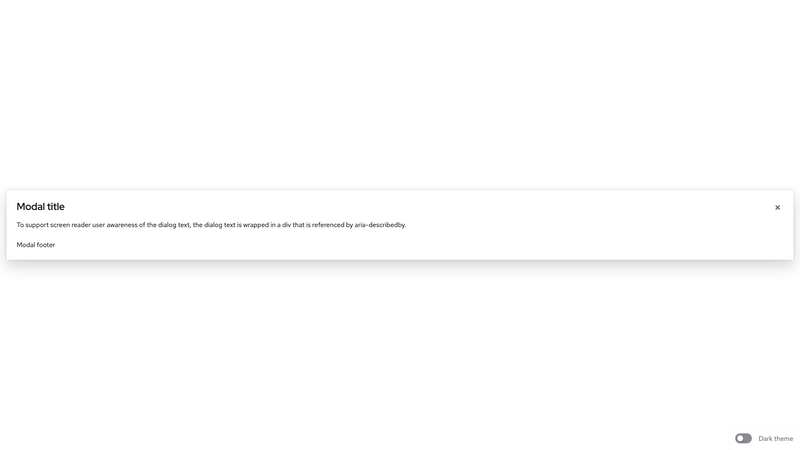
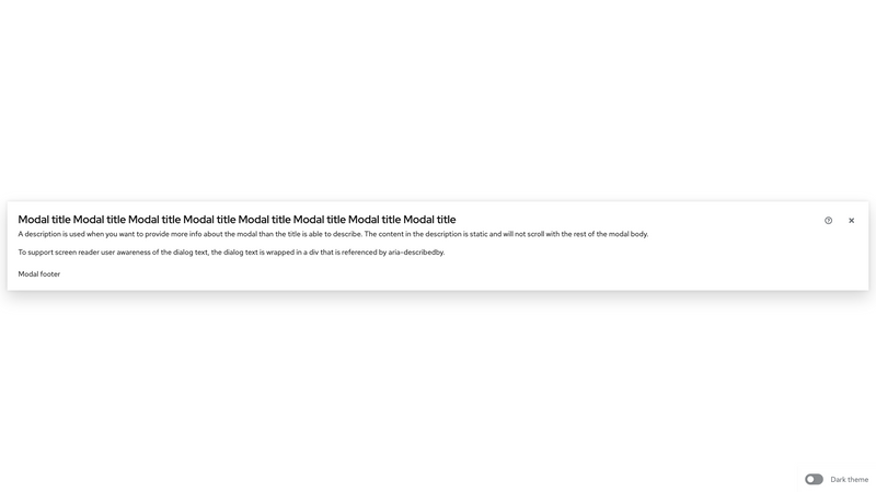
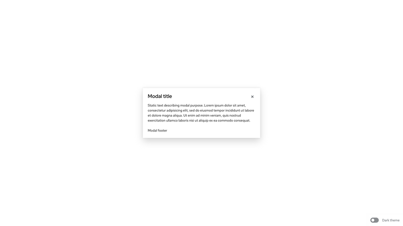
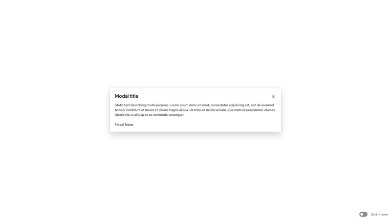
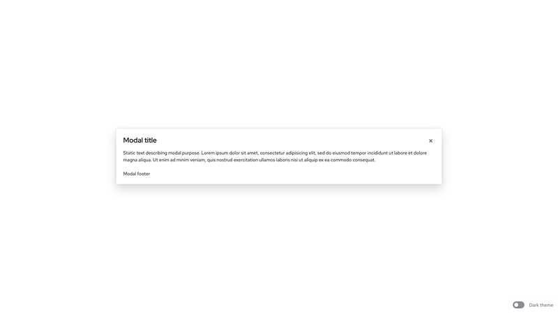
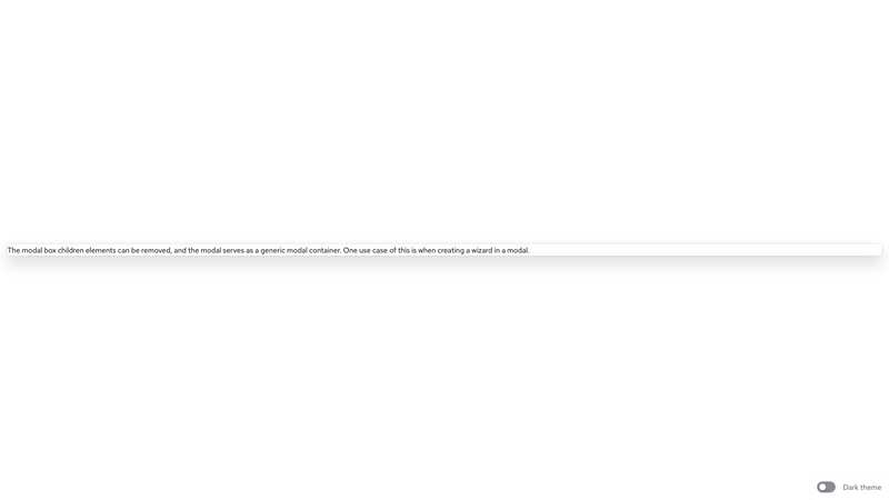
A modal box is a generic rectangular container that can be used to build modals. A modal box can have the following sections: header, title, description, body, and footer. With normal use of the modal, a title or body is required. Alternatively, no child elements can be used, and the .pf-c-modal-box container will serve as a generic container with no padding for custom modal content. If no .pf-c-modal-box__title is used, aria-label="[title of modal]" must be provided for .pf-c-modal-box.
Accessibility
Attribute | Applies to | Outcome |
|---|---|---|
role="dialog" | .pf-c-modal-box | Identifies the element that serves as the modal container. Required |
aria-labelledby="[id value of .pf-c-modal-box__title or custom modal title]" | .pf-c-modal-box | Gives the modal an accessible name by referring to the element that provides the dialog title. Required when .pf-c-title is present |
aria-label="[title of modal]" | .pf-c-modal-box | Gives the modal an accessible name. Required when .pf-c-modal-box__title is not present |
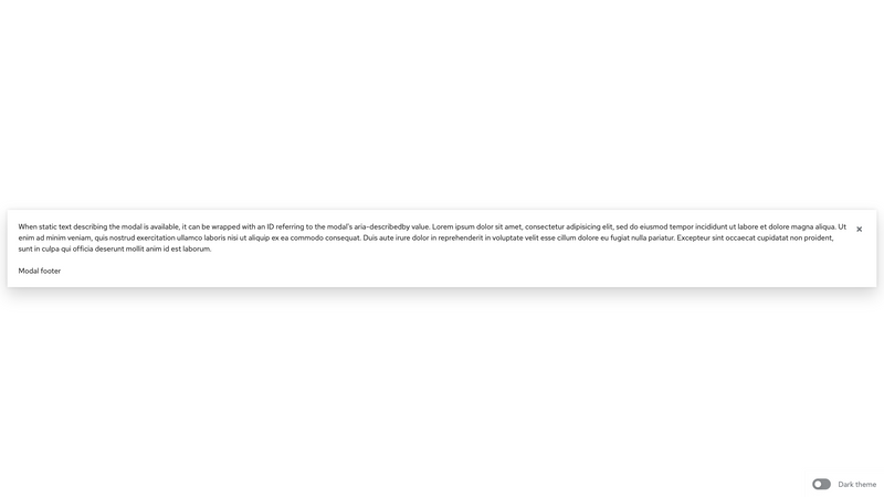
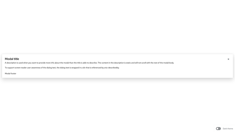
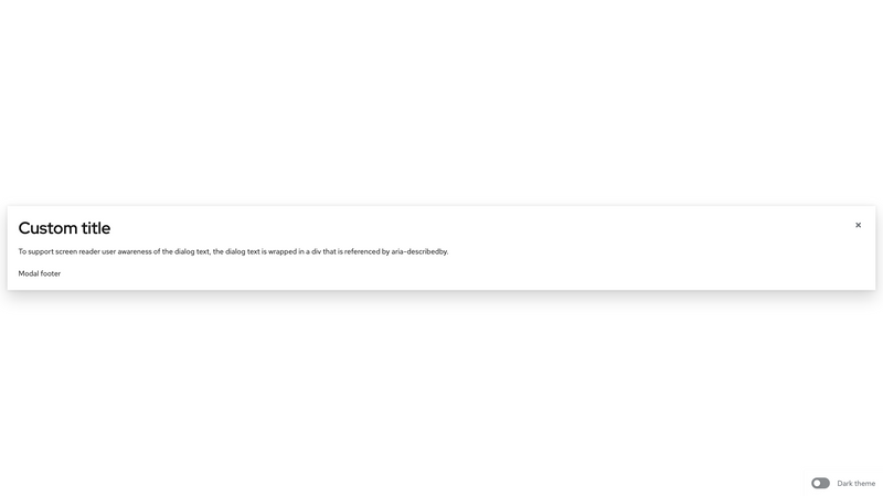
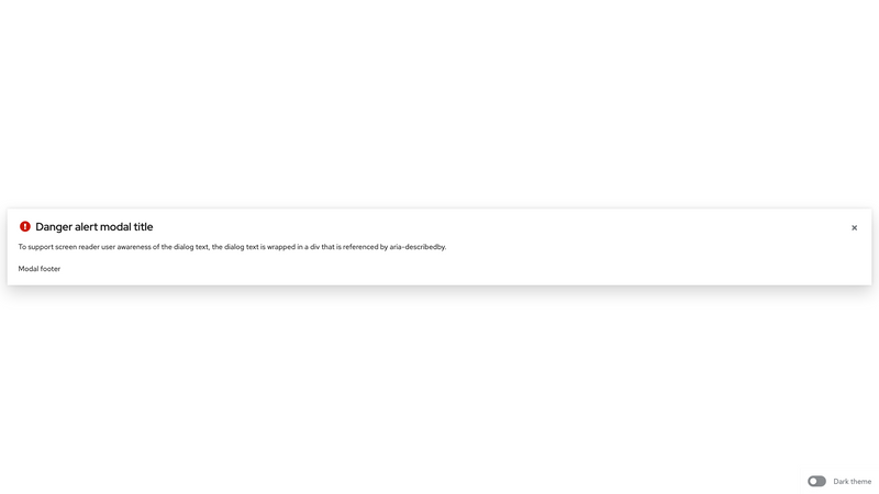
aria-describedby="[id value of applicable content]" | .pf-c-modal-box | Gives the modal an accessible description by referring to the modal content that describes the primary message or purpose of the dialog. Not used if there is no static text that describes the modal. |
aria-modal="true" | .pf-c-modal-box | Tells assistive technologies that the windows underneath the current modal are not available for interaction. Required |
aria-label="Close" | .pf-c-modal-box__close .pf-c-button | Provides an accessible name for the close button as it uses an icon instead of text. Required |
aria-hidden="true" | Parent element containing the page contents when modal is open | Hides main contents of the page from screen readers. The element with .pf-c-modal-box must not be a descendent of the element with aria-hidden="true". For more info see trapping focus. Required |
form="[id of form in modal body]" | .pf-c-modal-box__footer .pf-c-button | Associates a submit button in the modal footer with a form in the modal body. For use when the submit button is outside of the <form> that the button submits. |
tabindex="0" | .pf-c-modal-box__body | If a modal box body has overflow content that triggers a scrollbar, to ensure that the content is keyboard accessible, the body must include either a focusable element within the scrollable region or the body itself must be focusable by adding tabindex="0". |
Usage
Class | Applied | Outcome |
|---|---|---|
.pf-c-modal-box | <div> | Initiates a modal box. Required |
.pf-c-button.pf-m-plain | <button> | Initiates a modal box close button. |
.pf-c-modal-box__header | <header> | Initiates a modal box header. Required if using a .pf-c-modal-box__title. |
.pf-c-modal-box__header-main | <div> | Initiates a modal box header main container. Required when pf-c-modal-box__header-help is used. |
.pf-c-modal-box__header-help | <div> | Initiates the help button container in the modal box header actions. |
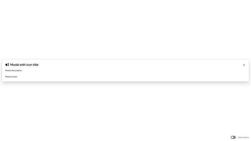
.pf-c-modal-box__title | <h1>,<h2>,<h3>,<h4>,<h5>,<h6>, <div> | Initiates a modal box title. Required if using a modal description. |
.pf-c-modal-box__title-icon | <span> | Initiates a container for the modal box title icon. |
.pf-c-modal-box__title-text | <span> | Initiates a container for the modal box title text. |
.pf-c-modal-box__description | <div> | Initiates a modal box description. |
.pf-c-modal-box__body | <div> | Initiates a modal box body. |
.pf-c-modal-box__footer | <footer> | Initiates a modal box footer. |
.pf-m-sm | .pf-c-modal-box | Modifies for a small modal box width. |
.pf-m-md | .pf-c-modal-box | Modifies for a medium modal box width. |
.pf-m-lg | .pf-c-modal-box | Modifies for a large modal box width. |
.pf-m-align-top | .pf-c-modal-box | Modifies for top alignment. |
.pf-m-icon | .pf-c-modal-box__title | Modifies the title layout to accommodate an icon. |
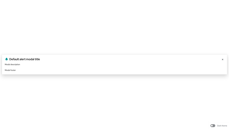
.pf-m-default | .pf-c-modal-box | Modifies for the default alert state. |
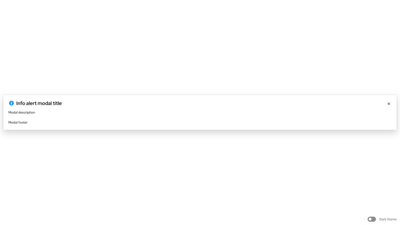
.pf-m-info | .pf-c-modal-box | Modifies for the info alert state. |
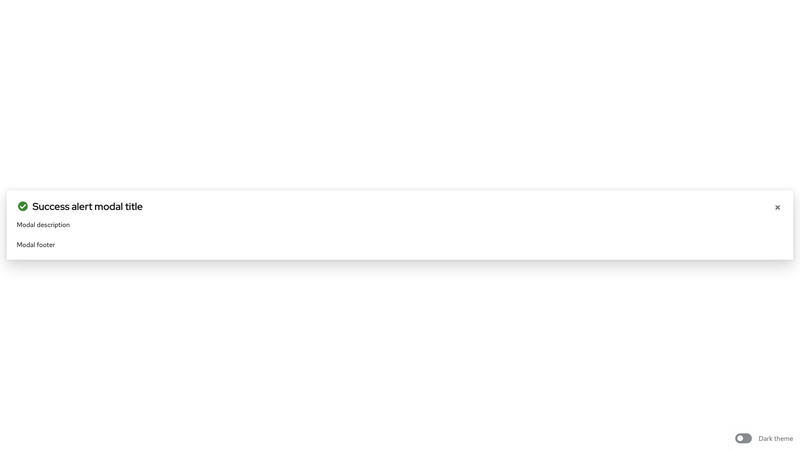
.pf-m-success | .pf-c-modal-box | Modifies for the success alert state. |
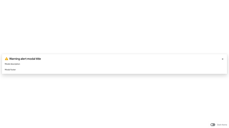
.pf-m-warning | .pf-c-modal-box | Modifies for the warning alert state. |
.pf-m-danger | .pf-c-modal-box | Modifies for the danger alert state. |
.pf-m-help | .pf-c-modal-box__header | Modifies the modal box header to support the help action |
CSS variables
| .pf-c-modal-box | --pf-c-modal-box--BackgroundColor | #fff | ||
| .pf-c-modal-box | --pf-c-modal-box--BoxShadow | 0 1rem 2rem 0 rgba(3, 3, 3, 0.16), 0 0 0.5rem 0 rgba(3, 3, 3, 0.1) | ||
| .pf-c-modal-box | --pf-c-modal-box--ZIndex | 500 | ||
| .pf-c-modal-box | --pf-c-modal-box--Width | 100% | ||
| .pf-c-modal-box | --pf-c-modal-box--MaxWidth | calc(100% - 2rem) | ||
| .pf-c-modal-box | --pf-c-modal-box--m-sm--sm--MaxWidth | 35rem | ||
| .pf-c-modal-box | --pf-c-modal-box--m-md--Width | 52.5rem | ||
| .pf-c-modal-box | --pf-c-modal-box--m-lg--lg--MaxWidth | 70rem | ||
| .pf-c-modal-box | --pf-c-modal-box--MaxHeight | calc(100% - 3rem) | ||
| .pf-c-modal-box | --pf-c-modal-box--m-align-top--spacer | 0.5rem | ||
| .pf-c-modal-box | --pf-c-modal-box--m-align-top--xl--spacer | 2rem | ||
| .pf-c-modal-box | --pf-c-modal-box--m-align-top--MarginTop | 0.5rem | ||
| .pf-c-modal-box | --pf-c-modal-box--m-align-top--MaxHeight | calc(100% - min(0.5rem, 3rem) - 0.5rem) | ||
| .pf-c-modal-box | --pf-c-modal-box--m-align-top--MaxWidth | calc(100% - min(0.5rem * 2, 2rem)) | ||
| .pf-c-modal-box | --pf-c-modal-box--m-danger__title-icon--Color | #c9190b | ||
| .pf-c-modal-box | --pf-c-modal-box--m-warning__title-icon--Color | #f0ab00 | ||
| .pf-c-modal-box | --pf-c-modal-box--m-success__title-icon--Color | #3e8635 | ||
| .pf-c-modal-box | --pf-c-modal-box--m-info__title-icon--Color | #2b9af3 | ||
| .pf-c-modal-box | --pf-c-modal-box--m-default__title-icon--Color | #009596 | ||
| .pf-c-modal-box | --pf-c-modal-box__header--PaddingTop | 1.5rem | ||
| .pf-c-modal-box | --pf-c-modal-box__header--PaddingRight | 1.5rem | ||
| .pf-c-modal-box | --pf-c-modal-box__header--PaddingLeft | 1.5rem | ||
| .pf-c-modal-box | --pf-c-modal-box__header--last-child--PaddingBottom | 1.5rem | ||
| .pf-c-modal-box | --pf-c-modal-box__title--LineHeight | 1.3 | ||
| .pf-c-modal-box | --pf-c-modal-box__title--FontFamily | '"RedHatDisplay", "Overpass", overpass, helvetica, arial, sans-serif' | ||
| .pf-c-modal-box | --pf-c-modal-box__title--FontSize | 1.5rem | ||
| .pf-c-modal-box | --pf-c-modal-box__title-icon--MarginRight | 0.5rem | ||
| .pf-c-modal-box | --pf-c-modal-box__title-icon--Color | #151515 | ||
| .pf-c-modal-box | --pf-c-modal-box__description--PaddingTop | 0.25rem | ||
| .pf-c-modal-box | --pf-c-modal-box__body--MinHeight | calc(1rem * 1.5) | ||
| .pf-c-modal-box | --pf-c-modal-box__body--PaddingTop | 1.5rem | ||
| .pf-c-modal-box | --pf-c-modal-box__body--PaddingRight | 1.5rem | ||
| .pf-c-modal-box | --pf-c-modal-box__body--PaddingLeft | 1.5rem | ||
| .pf-c-modal-box | --pf-c-modal-box__body--last-child--PaddingBottom | 1.5rem | ||
| .pf-c-modal-box | --pf-c-modal-box__header--body--PaddingTop | 1rem | ||
| .pf-c-modal-box | --pf-c-modal-box--c-button--Top | calc(1.5rem) | ||
| .pf-c-modal-box | --pf-c-modal-box--c-button--Right | 1rem | ||
| .pf-c-modal-box | --pf-c-modal-box--c-button--sibling--MarginRight | calc(2rem + 0.5rem) | ||
| .pf-c-modal-box | --pf-c-modal-box__footer--PaddingTop | 1.5rem | ||
| .pf-c-modal-box | --pf-c-modal-box__footer--PaddingRight | 1.5rem | ||
| .pf-c-modal-box | --pf-c-modal-box__footer--PaddingBottom | 1.5rem | ||
| .pf-c-modal-box | --pf-c-modal-box__footer--PaddingLeft | 1.5rem | ||
| .pf-c-modal-box | --pf-c-modal-box__footer--c-button--MarginRight | 1rem | ||
| .pf-c-modal-box | --pf-c-modal-box__footer--c-button--sm--MarginRight | calc(1rem / 2) | ||
| .pf-c-modal-box.pf-m-sm | --pf-c-modal-box--Width | 35rem | ||
| .pf-c-modal-box.pf-m-md | --pf-c-modal-box--Width | 52.5rem | ||
| .pf-c-modal-box.pf-m-lg | --pf-c-modal-box--Width | 70rem | ||
| .pf-c-modal-box.pf-m-danger | --pf-c-modal-box__title-icon--Color | #c9190b | ||
| .pf-c-modal-box.pf-m-warning | --pf-c-modal-box__title-icon--Color | #f0ab00 | ||
| .pf-c-modal-box.pf-m-success | --pf-c-modal-box__title-icon--Color | #3e8635 | ||
| .pf-c-modal-box.pf-m-default | --pf-c-modal-box__title-icon--Color | #009596 | ||
| .pf-c-modal-box.pf-m-info | --pf-c-modal-box__title-icon--Color | #2b9af3 | ||
| .pf-c-modal-box__header + .pf-c-modal-box__body | --pf-c-modal-box__body--PaddingTop | 1rem | ||
View source on GitHub